Saturday, May 31, 2025

How to Create a Vintage Frame for Your Cards and Scrapbooks

Do you like to make vintage cards? Vintage is one of my favorite styles to create!  Follow the directions below to make a beautiful vintage frame to add to your cards and scrapbook pages!

You will need the following supplies:

  • Storybook Friends Die Set
  • Beautiful Gallery DSP (the sheet that has Pecan Pie and cream colored painted design)
  • Basic Beige card stock
  • fine tip glue pen
Steps
1. Begin by cutting the ornate oval frame from the die set in Basic Beige two times.
2. Cut a third frame using the Beautiful Gallery DSP
3. Adhere the two Basic Beige frames together. Using liquid glue will give you some wiggle room to align the curves and openings on the frames.
4. Adhere the DSP frame to the top of the two card stock pieces.
5. Use the frame to highlight a sentiment or image.  The layers of card stock create depth on your project.

Check back tomorrow for directions on how to complete a bookbinding gate fold fun fold card like the one I used my ornate frame on at the bottom of my post!


Friday, May 30, 2025

Majestic Mountains Kit Alternatives

I decided to use postage dies on a few cards from the kit to add some texture to my Paper Pumpkin alternative cards. 

For the first card, I wanted to create a more feminine card from the kit's contents.  I used one of the beautiful watercolor envelopes as DSP as a background for my card. Then, I used a postage die to cut one of the card fronts from the kit. I stamped "You mean the world to me" in Misty Moonlight ink on the die cut image.  I also cut a flagged shape from the Stylish Shapes die set and stamped a sentiment from the kit on it.

I stamped the cone flower image from the Mixed Floral stamp set, colored it with Stampin' Blends using the orange tones of Calypso Coral and Petal Pink. I chose these two colors because they are complementary (opposite) on the color wheel and pair well together.  Then I fussy cut a portion of the image and adhered it to the card.  I also tied Night of Navy Baker's Twine to the side of the card.


My second card using the postal dies is a Father's Day card.  I cut several images from the kit using the postal dies and two flagged shapes from the Stylish Shapes dies.  I turned one of the card fronts on its side for this background.  

I also masked a portion of the "I LOVE YOU" sentiment to delete the "I".  To to this, I used washi tape to cover the "I", inked the stamp, removed the tape, then stamped it on my die cut shape. I also trimmed the pre-made sentiment from the kit to fit inside one for the postage dies.

Don't be afraid to think outside the box with your kits!  They are beautiful as designed, but lots of fun to challenge yourself with using your craft stash!


Thursday, May 29, 2025

Customizing Your Scrapbook Pages with Stamps and Ink

One of the best reasons to use stamps and ink on your pages is that you can customize the colors to coordinate with your photos and documents. 

The layout I've created documents a day when my daughter and I went to Gunn Beach on Guam and played with the blue starfish.  This page documents facts about starfish and why they are such amazing creatures. 

I was able to create this page with a starfish as the background using Pacific Point ink and a starfish stamp.  I also used Melon Mambo card stock for the starfish facts. I wanted the bright blue color of the starfish to be the main color of this layout.  I also pulled the bright pink and green from my shirt color using Melon Mambo and Granny Apple Green card stock.  

I began by stamping the starfish over the Basic White 12 X 12 card stock as a side border and bottom right accent.  I also stamped a few shells to fill in open spaces between the starfish.  I used a piece of coordinating DSP to finish off the border on the right side of the starfish.  

TIP: Mask the right side of the border before stamping for a crisp edge.  

I printed my title and facts on Melon Mambo card stock.  Since it is such a bold color, I used bold text so it would be easier to read. 

I placed my double matted photos on the page then arranged the facts around the photos. Once I had everything where I wanted it, I adhered everything down.  

This is a very each layout to recreate for just about any occasion.  I can see it with birthday cupcakes or Christmas ornaments as a border and documenting the festivities from the day instead of using facts like I did on my page!  


Creating an Interactive Layout for your Albumn

Interactive layouts are fun and a good way to list facts about your topic.  I created a spinner 
for this layout to list reasons why my daughter and I enjoyed snorkeling at Gab Gab Beach so much.

I began by stamping a circles over the background to give the illusion of air bubbles.  I masked a circle area on my brown card stock, stamped fish and sponged the area with Chocolate Chip Ink.  

For the fish, I used a circle punch for the bodies and crinkled the paper until the fibers weakened enough to pull them apart.  I did this to give them texture.  I cut a sheet of card stock from a square punch and then cut it into fourths to create triangles for their tails. 

The wave was created with a die using both the negative and positive images from the cutting plate.  

I used my computer to create a circle, divide it into sixths, and type the reasons we enjoyed snorkeling at this beach in each section.  I used a flower punch, arrow punch and brad to create the spinner.

Lastly, I used stamps that resembled tropical images to create a few embellishments that coordinated with the colors I used.  

I used a ribbon and ribbon charm to anchor the page.


Wednesday, May 28, 2025

Paper Pumpkin Majestic Mountains Scrapbook Page

I decided to try something different with my May Paper Pumpkin kit and created a scrapbook page from a vacation we took to Chattanooga, TN.

I used the retired Natural Textures stamp set to create a tone on tone background with the stone path stamp using Petal Pink ink.

Then I created photo mats from the beautiful watercolored envelopes included in the kit.  I used postage dies for journaling and photo corners.

I also used one of the flagged images from the Stylish Shapes dies to journal three reasons we enjoyed Rock City. By using the same image 3 times, it creates unity on the page.

Lastly, I used one of the tree images from the kit as an embellishment.

This is an easy layout to recreate from birthdays to retirement pages. I hope you will give it a try!


Tuesday, May 27, 2025

Turning the Majestic Mountains Paper Pumpkin Kit to Balmy Beaches Cards

 I love the Majestic Mountains Paper Pumpkin kit and the cards are designed beautifully! However, I live at the beach and send more beach themed cards.  I did some flipping, masking and adding the Friendly Seagulls Sale-a-Bration stamp set to the kit to give it a more "beachy" vibe!

For the first card, I needed a quick and easy graduation card. I incorporated two older Paper Pumpkin kits, one from March 2016 (graduation sentiment) and the other from April 2018, (beach images).  One of the great things about these kits is that you slowly acquire a nice collection of stamps over the years!


The next two cards use the Friendly Seagulls stamp set. For the first card, I simply used the tearing technique to create the illusion of white caps on the waves.  For this technique, be sure to tear the paper toward you to get the white edge to appear!  I trimmed the legs off the seagulls to appear as though they were swimming and sponged a little Daffodil Delight to resemble a setting sun.  I added a few fish as embellishments. The "hugs" die is from the add on die set for the April, May and June kits.


For the last card, I flipped it upside down so that the sky image was at the top to resemble water and the land looks like the sandy shore.  I masked near the edge of the Crumb Cake color so that as I ink blended my Daffodil Delight over the bottom half of the card, didn't bleed over to the tan. I also turned the bird image stamp upside down and stamped it in Secret Sea ink to resemble waves. Last, I tied some white twine in knots to give a nautical feel to the card.


Monday, May 26, 2025

Patriotic Card for Memorial Day

 Memorial Day...a day to remember those who have paid the highest price for our freedom.  

I created this card using the Elements of Text stamp set to add texture to the white flowers and background of the card.  Both were stamped in Real Red ink.

I used the large oval with Basic White card stock and the Forever Plaid embossing folder to create a textured background for my image.  I also cut the oval frame using Secret Sea card stock.

The flowers were die cut using Real Red, Basic White and Misty Moonlight card stocks.  Small pearl embellishments were added to the smallest flower centers.

I hope you are making the most of this holiday and will pause for a moment to pray for those who have lost loved ones by giving the ultimate sacrifice for us!

May God bless our country! <3


Sunday, May 25, 2025

Using Punches as Accents of Your Scrapbook Pages

 I have a large variety of paper craft punches that I use often to create quick and easy page embellishments. Punches allow me to choose the color I want my embellishments to be be and I can make as many as I want so I don't have to buy multiple packages of stickers or fear of running out of them!

For my first page, It's a Boonie Thing", I used a side punch that resembles a torn piece of notebook paper for my journaling.  I also used a tab punch to recreate the look of a tabbed sheet.

The second layout uses a 1" circle punch and several patterns of So Saffron DSP to create a border on the left side of the page. I also used a small flower punch and Real Red card stock to create tiny red flowers as embellishments.  I used Granny Apple Green ink to stamp the leaf images around the page before I adhered the red punched flowers to the layout. 

Take a look at your punch collection!  Punches are so versatile, I feel certain you can find some to put to good use on your layouts!


Saturday, May 24, 2025

Creating Focal Points on Your Pages

When you begin planning your layout, choose a focal point and colors that coordinate with it.  For my layout, I chose colors that coordinated with the top I was wearing.  I also made the focal point picture a little larger than the other photos.  

This memory book page documents Liberation Day in Guam 2009.  This is the day the Marines freed the residents of Guam being held by the Japanese at the end of World War 2.  It is celebrated on July 21st each year with a parade, picnics and other festivities.

I used a Stampin' Up! scrapbooking kit, that is now retired, because it coordinated so well with the colors I chose and the tropical vibe I wanted to others to feel when looking at the page.

While this kit is no longer available, there are other tropical sets and floral kits you can use to recreate this page. The new Florals in Bloom Suite would be a good collection that would work well to create a tropical vibe on your pages. 

One of the best things about using stamped images in your scrapbook is that you can custom design the colors you want to use.  I'll share more about this in an upcoming post, so keep an eye out for that in the next few days!


               Florals in Bloom Suite


Friday, May 23, 2025

Majestic Mountains May Paper Pumpkin Kit

 Have you started creating with your May kit?  I was able to work on mine for a bit today.  The card I created is close to the original one designed by Stampin' Up! artists.  I added a retired sailboat image to the card to create a focal point.  

I also added a lot of text to each layer of the design.  This is a technique I saw being used by Christian artist Hannah Dunnett.  Her cards are stunning.  If you have a moment, check out her website


If you are looking for a sailboat image Stampin' Up! has a beautiful one called Sunrise Sailing.  There are so many images and dies that can be used for creating masculine cards, summer scrapbook pages, birthday cards, etc.


165497

SUNRISE SAILING BUNDLE (ENGLISH)

$50.25

Thursday, May 22, 2025

Coneflowers Aren't Just for the Birds!

 Coneflowers are my favorite flower in the garden!  I love that not only are they beautiful, they supply food for the birds once their color has faded and the seeds remain. 

The Mixed Florals stamp set has a gorgeous coneflower image with other flowers mixed in. I only used a portion of the image on the card I created today. The bright and cheerful DSP  used in the background is also from the Mixed Floral bundle. 

The cute little "Hello" stamp is from the More Than Autumn stamp set.  If you haven't taken a look at this set, it is definitely a good one with so many options to work with! There are even a few cheerful ladybug images in the set!

The card stock colors I used are Calypso Coral and Poppy Parade. The image was colored with Stampin' Blends and highlights were added with a white gel pen.


Wednesday, May 21, 2025

Ready to Begin Your Album?

Let's talk about the beginning page of your album.  It is only one page and can be a preview of things to come in your memory book.  I like to refer to it as a title page!  

When we moved to Guam, I knew I was going to be documenting a lot! of memories  I decided to create a grid for my opening page of my scrapbook.  

Based on a 12 x 12 page with a 1 inch border, my grid would need to be 11 x 11.  Each square would be 2.75 x 2.75.  I could also use rectangles measuring 2.75 x 5.5.  

Next, I decided on my color palette.  Stampin' Up! has so many gorgeous coordinating Designer Series Papers that this step was super simple!  We moved to Guam in 2009, so this paper is no longer available but there are plenty of others to choose from in the Annual Catalog and Online Exclusive Store!

I looked for photos that I could crop to 2.72 x 2.75, cut several pieces of DSP in this size and placed my title on the larger 2.75 x 5.5 rectangle.  Then I looked for stamped images and embellishments to incorporate into the layout.  

The next part of the process is what I enjoy the most!  Arranging everything on the page to make sure it is pleasing to the eye.  First, I placed the DSP pieces down, trying to assure patterns with coordinating colors were next to each other.  Again, this is easier when you are using a coordinating pack of paper.  Once that was done, I placed embellishments where I thought they looked best.

I adhered the embellishments to the squares then adhered the squares to the 12 x 12 page.  

Sometimes the eye likes something random, so I placed the latte stone a little outside of the bottom third square.  

If you give the grid method a try, I'd love to see your creation.  Feel free to post your grid page in the comments section of this post for others to see as well!  It is always more fun to share ideas with fellow scrapbookers!

Tuesday, May 20, 2025

May Challenge: Switching Up Color Take 2

 Stampin' Up!'s May Challenge is to choose a layout from the new Annual Catalog or May Online Exclusives and recreate it using different colors.  

For this card, I choose the Blooming Phrases from the Online Exclusives store.  I cut a large postage image from a die and stamped floral images from the set.  I choose to use the warm colors of Timid Tiger and Strawberry Slush. Side note...don't you love the 2025-2027 In Colors?  The leaves were stamped in Old Olive using first and second generation stamping to create depth. I also added a few In Color embellishments for the center flowers and three Secret Sky In Color pearls. 

Tip: While stamping the flowers, I masked the bottom of the die image so that all the floral stems were even across the base for the card.

Here is the original card created by SU! artists and the directions for how you can recreate it!


Monday, May 19, 2025

What to Think About Before You Dive into Your Layout

 Thanks for stopping by!  I hope you are going to join me on my scrapbooking journey!  

Before you begin cutting, stamping and journaling, you need to make a few decisions about your layout.

1. How many pictures are you going to include?

2. Is there enough pictures to create a two page layout?

3.  What colors are in the pictures that you can pull out to coordinate with the page(s)?

4. Is there a story I want to tell with my layout?

For the layout I created below, I wanted to convey a spooky vibe.  While we were living on Guam, we often heard of taotaomonas (ghosts of the jungle).  I bought this picture of a "hidden" spirit hiding among the leaves and wanted to highlight it as well.  

Referring to the guidelines above...

1. I had one picture to include on the page.

2.  There were not enough elements for a two page layout.

3. The colors I choose were black and olive green. Black being a "spooky" color and olive green being the color of the green leaves in the jungle picture.

4. Yes, I had a story I wanted to tell in the layout.

TIP:  I like to use my computer for much of my journaling because I can type faster than I can write and if there is a lot of information, I can put it in a smaller space by typing it! However, there is a time for handwriting as well!

Once I printed the story on Basic Gray card stock, I used a Halloween set to stamp spooky images around the journaling in black ink.

I used a circle punch to cut out the ghostly image, then mounted it on a slightly larger circle and placed it back on the photo, creating a highlighted area.

I also used a corner punch to create bat images in the negative space and to anchor my journaling section at the bottom.

Designer Series Paper was used to mount some information about Latte Stones since that was also in the photo.


Although this is a relatively simple layout, I feel it conveys exactly what I wanted it to.  The focal point is on the "spirit" and story that goes along with it.

Join me next time for another sample of ways to document your memories!

Happy Stampin',
Tonya

Sunday, May 18, 2025

Join Me on My Scrapbooking Journey!

 Do you enjoy scrapbooking? For the first 18 years of my daughter's life, I created a scrapbook each year to document the memories we made.  We are a military family that moved often and we always took advantage of our assignments, visiting lots of places around the Air Force base we were stationed.  So, I also created a book for each military move/ vacation that occurred during those years as well.  

I used a variety of materials for the memory books,...stamps and ink, retired Stampin' Up! Scrapbook kits and the retired Stampin' Up! digital platform for creating memory pages.  I have been a Stampin' Up! Demonstrator for over 25 years and I enjoyed incorporating all of their products into my pages. 

However, once my daughter left for college, my scrapbooking slowed down tremendously! Time moved on and now I am blessed with two grandchildren! It is time to get back into the scrapbooking groove!

Over the next few weeks, I'm going to share pages I've created from past years, highlighting the supplies I listed above and techniques I learned along the way. 

My goal is two fold: 

   1. To share time tested tips that you can use in your pages now with samples from my older pages

   2. To share sketches that you can recreate in your memory books beginning today!

In the upcoming months, I will be sharing new pages I am creating for my grandchildren so that we can document a second generation of memories!  I hope that you will join me on this journey of reviving my scrapbooking skills and create with me.

If you enjoy the great outdoors, this is a new scrapbooking kit by Stampin' Up!  It is called Weekend Adventures.  The item number is 167315.

Saturday, May 17, 2025

April Paper Pumpkin - Inked Occasions

 Have you completed your April Paper Pumpkin kit?  

I have finished the kit and love all the bright colors that were in it!  I even combined the March Daisy Daydreams kit with it for a unique bee card.  

My cards are below.  Which one is your favorite?  My favorite is the...


...the Hello card!


Friday, May 16, 2025

Hello Friend Card

Happy Friday!  I hope you can arrange time in your weekend for card making!  

This card is made with Pool Party card stock, Floral Impressions DSP and elements from the Storybook Moments suite.

The watering can is created with 2 dies using two different colors  of Pool Party Two Toned card stock to give it depth.  

The sentiment is embossed on Night of Navy card stock with white embossing powder. I also used three small pearls to embellish the sentiment.


Thursday, May 15, 2025

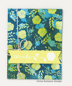
Switching Up Color Challenge

 Have you seen the May Creative Challenge by Stampin' Up?  It is called Switching Up Color and it is a lot of fun!  The challenge is to take a card sample from the SU! catalog or Online Exclusive Store and recreate it changing the colors.  Below is my version of the challenge!

Here is the sample created by SU!


This technique was so fun, I decided to create two cards using it.  I have listed the colors of card stock and inks used below each card. 

Card stock: Very Vanilla

Inks: Poppy Parade  Cherry Cobbler


Card stock: Bubble Bath
Inks: Lost Lagoon and Pretty Peacock

How to create this look:
1. Clear emboss an image of a light color of card stock.
2. Use ink blending brushes to blend darker ink colors over the entire card. The clear embossing will repel the ink and will easily wipe off.
3.  Splatter the card with water, wait a few seconds and dab off.  

This is such a fun technique and gives such stunning results!!

Water Coloring Over White Embossing...Will it Work?

I love the look of white embossing! Whether it is on Crumb Cake card stock or ink blending over it on white card stock to make an image pop....