Saturday, June 21, 2025

Water Coloring Over White Embossing...Will it Work?

I love the look of white embossing! Whether it is on Crumb Cake card stock or ink blending over it on white card stock to make an image pop.  As I was working on a card last week using this technique, I wondered how the white embossing would work if I tried water coloring over it.  

I used white embossing powder to emboss the large floral image from the upcoming Floral Charm Suite, available July 1st, on Crumb Cake card stock and also on Basic White card stock. Then I placed a drop of Fresh Freesia and Granny Apple Green reinkers on a clear stamping block.  I spritzed a little water on the ink drops and painted my image using the reinkers as watercolor.  I use this technique often when watercoloring and love the soft look I get with it.  

It worked just like ink blending, the color popped beautifully!


I cut a piece of Crumb Cake card stock to an A2 size, then cut 1.5" off the side of it for my card base.  I mounted the Crumb Cake panel on a Lemon Lime Twist card panel, then mounted both to the front of my altered card base. 

I cut a piece of Basic White card stock at 4" x 5.25" to place inside my card. Then I cut a 4" x 2" piece of Perennial Lavender DSP to glue to the inside base to make it peek out from under the top panel of my card. 

I cut out the floral image using the coordinating die and adhered it with dimensionals, being careful to only place them on the top, back portion of the image so that my card would still be able to open.

To finish the card, I tied a bow from Fresh Freesia seam binding ribbon and placed it to the left of the floral image. The ribbon was one of the 2025 Sale-a-Bration gifts this year. 

I'm so happy with how my card turned out!  I will definitely be using this technique again!


Friday, June 20, 2025

Timeless Plaid DSP and Floral Designs...What a Combination!

Do you like the look of plaid?  I love it, especially paired with florals.  For my two cards today, I used the Timeless Plaid DSP and the Your Are Remarkable stamp set. Spotlight on Nature is the die set I chose to use for these cards.

For the first card, I cut two large circles from the die set in coordinating patterns of DSP.  I stamped the small texture stamp from the set on the left side of the card in Pecan Pie ink.

I added more texture with the splatter dot stamp in the set, then cut my two circles to better fit the card base. I also used Calypso Coral and the splatter stamp to add more splatter on the card base and DSP.  I stamped my sentiment in Mossy Meadow ink and tore the bottom edge of the card stock. Then I layered the sentiment on a piece of Mossy Meadow card stock and tore the bottom edge of it as well.  After layering the two pieces, I tied a piece of linen thread around it.

I colored my flower using Calypso Coral and Mossy Meadow Stampin' Blend markers. I used the dark Petal Pink Blend to color the center of the flower.

To finish off the card, I add the little bee stamp, also from the set, and a few brass butterfly embellishments. 

For my second card, I cut a stitched rectangle from Basic White card stock, then stenciled using a mask and ink blending brush in Calypso Coral ink.  I was careful to apply less pressure as I moved from the center of the piece to give it a fading look.  I stamped my floral image and small bee in Memento Black ink and colored it using Lemon Lolly, Calypso Coral and Old Olive Stampin' Blend markers. 

My sentiment  and splatter are stamped in Pecan Pie ink.  I tore another piece Timeless Plaid DSP and placed it in the top left and bottom right corners of the card. I used a heart die to cut 3 pieces of Calypso Coral and layered them to create a 3D embellishment that I placed on the bottom right of the card.

I cut an A2 Pecan Pie card base, then layered a piece of Calypso Coral card stock cut at 4" x 5.25"  and my stamped design.

Have you tried the Timeless Plaid DSP?  It is so versatile and pretty!


Thursday, June 19, 2025

My First Two Alternatives With the Full of Charm Paper Pumpkin Kit

Woohoo!!! My kit arrived a day earlier than expected!  Needless to say, I was so excited to open it and begin creating with it.  

There are so many pretty pieces in this kit!  For my first two alternatives, I cut one of the cards in half to create two separate cards.  

For the Miss You card, I stamped "To a Wonderful Friend" and "Miss You" with the Pretty Peacock Ink Spot that came with the kit. I stamped the floral image in Berry Burst, then wiped the pink off the stem of the image and used an Early Espresso Stampin' Write marker to color it in.  I stamped the image on the center of the card.  I inked small portions of the leaf image and stamped the leaves around  the floral image.  I used both saturated and second generation inking.

I mounted the card front on the A2 Pretty Peackok card base, then used dimentionals to raise the "To a Wonderful Friend" sentiment. I added three of the gold sequins that were in the kit and a gold thread bow to the floral bouquet. 

I tried something different with the "Thank You" card.  I used a ruler and two Stampin' Blends markers to highlight the gold lines on the card front.  I used the maker colors Berry Burst and Mossy Meadow.  I colored in one diamond in each section with a Stampin' Write Blackberry Bliss marker. I mounted this card front on a piece of Blackberry Bliss card stock cut at 4.25" x 5.5"

I traced the stitched lines on the pre-cut sentiment piece in Mossy Meadow to create solid lines and stamped the sentiment in Berry Burst ink.

Because the kit has so many beautiful pieces, I want to make the most of each of them.  I took a portion of the large pink floral piece and cut a small section of it, trimming some of the white outline off.  I also cut the Mossy Meadow punch out leafy piece and cut it into two pieces.  I arranged the pieces around the sentiment and adhered it with dimensionals to the card center.  

To finish the card, I added a few gold sequins and a double bow from gold thread.

This is such a beautiful kit and I can't wait to see what everyone creates with it!


How to Use Your Stamping Blocks to Create Beautiful Backgrounds

Do you like the look of a watercolored background, but not sure how to make it work? You can use your clear stamping blocks to get this look in just a few easy steps!

Begin by tapping your ink pad onto a clear block of your choice.  Gently spritz water onto the inked block, then press it onto Basic White card stock and lift it directly up. 

Tip: Be careful not to spritz too much water on your block.  Too much water will cause the color to drip as you turn your block over to stamp with it.  

Allow your card stock to completely dry by setting it aside for a few minutes or using a heat tool to dry it.

For the card I created, I used a stamping block to create my watercolor background.  I also added some splatter using a reinker, water, stamping block and splatter brush.  I simply placed a couple of drops of Starry Sky reinker (retired) on a block, added a drop or two of water, then dipped my splatter brush into the puddle of color and tapped it over my card stock. 

I used the flower from the You Are Remarkable stamp set and colored it using the left over color from the ink and water I had on my stamping block.  My sentiment is from a past Paper Pumpkin kit and is stamped on a circle of Basic White card stock. I cut it using the Spotlight on Nature dies.

To finish the card, I added a strip of vellum behind the sentiment and a bow from Night of Navy baker's twine.

Get double duty from your stamping blocks by using them to create interesting backgrounds!


Wednesday, June 18, 2025

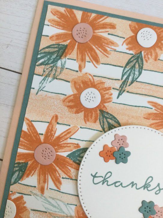
Stepping up the Painted Stripes Background Stamp

I love the Painted Stripes large background stamp and have been eyeing it for quite a while.  I recently purchased it and made my first card with it today.  It is now official...it's my favorite background stamp... EVER!!
                                                                      
I inked the stamp with Petal Pink by holding the ink pad in my hand and pressing it onto the large stamp.  For me, this is the easiest way to apply the ink to the large surface.

Then I took the flower stamps from Impressions Abloom set and stamped them with Timid Tiger ink.  I stamped off for the solid stamps and used the fully saturated ink for the outline stamps. I stamped the leaves in Lost Lagoon ink.  

I loosely outlined the paint lines with my Lost Lagoon Stampin' Write marker.  Once that was completed, I used the dies from the Impressions Abloom bundle to cut flower centers using the smallest circle die in Basic White and Petal Pink card stock.  I also cut the tiny flowers for my sentiment from the same die set using Lost Lagoon, Petal Pink and Timid Tiger card stock.


I cut a circle from the Stylish Shapes die set in Basic White card stock and used the " thanks" stamp from the Blooming Phrases stamp set in Lost Lagoon ink.  I adhered the tiny flowers in two clusters of three and used dimensionals to raise the sentiment off the surface of the card front.  This casts a slight shadow on my card to create depth. 

I layered a piece of 4" x 5.25" Lost Lagoon card stock onto a Petal Pink A2 card base, then adhered my stamped design onto the Lost Lagoon rectangle. The measurements of my stamped design are 3.75" x 5".

Are you wondering how I came up with the unique color combination?  It is the weekly challenge for the Global Design Project.  You can see my card and what others created with this great color combination on Instagram using #GDP501.  :) I hope you will check them out!


Tuesday, June 17, 2025

2025-2027 In Colors...All on One Card!

What are your thoughts on the new 2025-2027 Stampin' Up! In Colors?  I absolutely love them and am looking forward to using them a lot over the next two years!

My card for today uses all the In Colors, Darling Duckling, Timid Tiger, Strawberry Slush, Cloud Cover, and Secret Sea. I used two stamp sets, More than Autumn for the images and Blooming Phrases for my sentiment.  


Are you wondering where the ice cubes for the frosty drinks came from?  I used the marshmallows that are intended to top the hot cocoa for the ice cubes! I masked off the center of each cup and stamped the marshmallow image above and below the mask. I used a light Pool Party Stampin' Blend marker to add just a hint of color to them as well.

My card base is an A2 Basic White card.  I used the new In Color Cloud Cover DSP as a background.  I gently tore the top and bottom edges, stamped sprinkles and hearts on it using Secret Sea and adhered it to the card base.  I also added small dots in groupings of three using the Cloud Cover Stampin' Blend for a subtle pattern to the DSP to create more depth.

All images were stamped in Momento Black ink, colored them with Darling Duckling, Timid Tiger and Strawberry Slush Stampin' Blend markers, then used my Stamp, Cut and Emboss machine to cut them out.

Are you wondering how the plaid cup holders were made?  I used a background stamp from the upcoming Party Celebrations.  I used my new In Color Stampin' Write markers to color the background stamp in the same new In Colors and stamped it on Basic White card stock. Then I stamped the middle portion of the cup on each of the colors, cut them out and glued them to the cups.

I assembled each cup, then placed them on the card front.  I used dimensionals to adhere the whipped toppings above the cups.  

I stamped the "celebrate" in Secret Sea ink and added three Secret Sea Pearls to finish off the card. 

The 2025-2027 In Color collection is an amazing group of colors!  I cannot wait to see how everyone uses these colors in the next two years! <3


Monday, June 16, 2025

Splish, Splash...Water Splatter!

One of the things I love most about Stampin' Up's inks is that it is water reactive.  Did you know you can ink blend a background, splatter it with water, then lift the water off to create a great splatter effect?

To create my card, I cut a square from the largest Stylish Shapes die on white card stock.  I embossed the flower from the stamp set, You Are Remarkable, in white embossing powder.  Then I used the embossed resist technique to ink blend Strawberry Slush, Pecan Pie, Lemon Lime Twist and Balmy Blue inks over the image to make the white embossing pop!

I also cut a Crumb Cake square in the same size and ran it through the Stamp, Cut and Emboss machine using the Forever Plain embossing folder.

I gently splattered some water over the ink blending, then used a paper towel to blot up the excess to create the pretty splatter design.

I embossed a partial sentiment from the same set in white embossing powder on Strawberry Slush card stock.  To do a partial image, simply use a low tack tape to cover the part of the image on your stamp you want to omit.  Ink the stamp, remove the tape, then stamp your image.  

I mounted a piece of Strawberry Slush DSP onto an A2 Basic White card base, then layered the other pieces as shown.  I used the Stylish Frames die to cut my sentiment out and adhered it with Stampin' Dimensionals. 

To finish it off, I added three adhesive pearls.

The splatter technique is easy, inexpensive and creates a beautiful background.  Give it a try!


Sunday, June 15, 2025

Bee My Valentine Isn't Just For February

Earlier this week, I shared that Stampin' Up! has a June color challenge. The challenge is to take a new In Color and combine it with some of our core color collections to create new color combos.

I decided to use the new Timid Tiger color the Calypso Coral, Cajun Craze, and Balmy Blue. Then I looked through my stamp sets to determine what set would work with these colors and landed upon Bee My Valentine.  I thought it would be fun to challenge myself to create a card with this set and the nontraditional colors!

I began by cutting a piece of Calypso Coral card stock to an A2 size card and another piece at 5" x 3.75" in the same color.  I used the Forever Plaid embossing folder to emboss the small piece of Calypso Coral.  Then I used some white acrylic paint and a little water to thin it down to add some splatter.  I felt the white brightened up the card.

I used the Stylish Shape dies to cut two squares using Basic White and Timid Tiger card stock.  On the Timid Tiger piece, I placed a circle from the same die set to cut a window into the square.  On the white square, I stamped a flower from the set in Calypso Coral, Timid Tiger and Cajun Craze several times.  I used the Light Balmy Blue Stampin' Blend to color the background.  On the Timid Tiger piece, I stamped the honeycomb in Calypso Coral randomly over the square.  

I added a piece of acetate to the back of the Timid Tiger square using tear and tape, then used foam tape to create a raised window for my shaker pieces. I used the bee punch to cut small hearts for my shaker in Basic White, Balmy Blue and Timid Tiger card stock. 

I also cut a circle using the same die set in Timid Tiger and stamped my sentiment in Cajun Craze and adhered it to the bottom right side of my card, cutting off the bottom of the circle aligned with the bottom of my card.

To create the bee, I used second generation ink from Timid Tiger for the solid image of his body and Cajun Craze ink for the lines, antennae, face and stinger.  The wings were stamped in Balmy Blue. I used the bee punch to punch the pieces out and adhered them together.

I added a few Balmy Blue and Basic White hearts, also from the bee punch, to finish my card. 

Feel free to join in the fun and create your own color combinations!  The challenge is open to everyone.  You can share your creation and see more on Instagram using #CreativeChallengeSU.


To create the mini treat box, see photos for directions. :)


Saturday, June 14, 2025

Floral Charm DSP With an Autumn Vibe

Who's ready for Autumn?  Well, although we are still a few months away, it's never to early to start planning for vibrant colored leaves; crisp, cool air; and pumpkin lattes!

Stampin' Up! is going to release some gorgeous autumn projects on July 1st! Being a demonstrator, I have the opportunity to order new products a month early and I've created a card using a few of these supplies to get ready for the cooler season.

To create my card, I used two new stamp sets. Party Celebrations has lots of imagery for fall and winter. that are a good size for scrapbooking and card making. The pumpkins are from this set.  The "Happy Birthday" sentiment and colored foliage DSP are from the Floral Charm Suite.  This suite also coordinates with the June Paper Pumpkin kit.

I started by cutting a 4.25' x 11' piece of Secret Sea card stock and scoring it at 5.5".  I also cut a piece of the DSP at 4" x 5.25" and adhered that to the card front.

I cut a stitched rectangle die with Basic White card stock and layered it on a piece of Timid Tiger card stock.

To begin stamping, I stamped one pumpkin shape on a post-it note to create a mask and cut it out as closely to the lines as possible. This is important to have your shapes touch when you are masking.  Then I stamped the blue pumpkin, using second generation stamping, in the middle of the white rectangle. I placed the mask over the blue pumpkin and stamped an orange pumpkin on each side of it. Then I stamped the stems onto each pumpkin in Pecan Pie ink.

Tip: When you are masking, stamp the object you want to appear in the forefront first and cover it with your mask before stamping objects around it.

I stamped my "Happy Birthday" sentiment above the pumpkins in Secret Sea ink and adhered the pieces of the card in place.  I finished it off with a double bow using linen thread.

This is a simple card sketch but very versatile for any season. I hope you will give it a try!


Friday, June 13, 2025

Bubbles, Ball and Blueberries...An Easy Summer Scrapbook Layout

Summer is full of exciting things to do and not so much time for getting scrapbook layouts completed.  

Here is an easy and fun way to capture the memories of summer using just a few supplies and very little time.

The key to this layout is lots of circles.  I used the circles on my layout to create the excitement of a trip to the baseball park.  But you could be picking blueberries at a produce farm, blowing bubbles in the backyard, or catching a tee ball game, the layout works the same!

I started my page by choosing the team colors of the Cincinnati Reds baseball team, a Real Red 12 X 12 page with some Pecan Pie two toned card stock to represent the dirt on the field.  Then, I mounted my 5 x 7 photo on Basic White card stock to make it stand out. Just placing it on the red page didn't draw the eye to it like mounting it on white did.

I cut several different sized circles using my circle dies, then used the edge of the dies and a Stampin' Blend Real Red marker to trace the curves for the stitches on each circle.  Once the curves were finished, I added stitch marks using the same marker.

I tore the piece of Pecan Pie card stock to reveal the white core for more definition on the page.  I used Pecan Pie ink and an ink blending brush to add "dirt" smudges to the baseballs and the torn brown strip of card stock.

I used my computer to create my title and story behind the photo.  I don't always use my computer to document on my pages. I also like to use my handwriting to document memories,  I have recipes from my aunt and grandmother that I love to look at just because they are written in their handwriting.  They bring back so many happy memories...and after all, isn't that the reason for scrapbooking!

I cut the words from my title into separate pieces and added some red stitching and dirt smudges to them as well before mounting them on Pecan Pie two toned card stock.

The last step of the layout was to arrange the balls around the page and adhere everything down.  

I hope you will give this layout a try.  Who knows...you may even see it again here on my blog with a different theme! ;) 


Thursday, June 12, 2025

Paper Pumpkin News Flash!

The June Paper Pumpkin kits are shipping today! I can’t wait to see the Full of Charm kit and begin working with it!  

Plus, as a demonstrator, I was able to order the coordinating suite, Floral Charm, this month. It will be available in early July for everyone else. I’ll put a sneak peek in the photos. 😘

With the shipping of the current kit, updates are given on the upcoming kit.  The July kit is called Sweeter With You and strawberries are the theme.  

There is also a new coordinating die set called Circle of Seasons (#167277) for the July, August, and September kits.  The strawberry die in the set will also cut an acorn to coordinate with the September kit. I love products that do double duty!

And an added surprise…there will be an extra stamp set in the August kit!  

So many good things come in that little box! ❤️😍 Be sure to subscribe by July 10th. Thank you for choosing me as your demonstrator!


Floral Charm Suite


Stampin' Up!'s Monthly Creative Challenge

Have you heard about SU!'s monthly Creative Challenge? On the first Wednesday of each month, SU! shares a challenge and everyone can play along! 

This month's challenge is to take the new In Colors and combine them with colors from the core collections to create new color combinations.  

I decided to combine the new Secret Sea with Soft Seafoam and Petal Pink.  I love the way the dark Secret Sea makes the soft colors pop!

For my card challenge submission, I cut a piece of Soft Seafoam card stock to a standard A2 card base.  Then I used the splatter image from the Elements of Text stamp set in the same color of ink for a subtle background.

I cut a stitched rectangle in Basic White card stock then scored it to create a tile effect.  Then I stamped the scripted text from the Elements of Text stamp set on the die cut rectangle. I also ink blended some Secret Sea ink using an ink blending brush to make the "tile lines" more prominent. I mounted this on a rectangle cut from Secret Sea card stock.

I used the Hugs Abloom die set to cut 3 flowers from Petal Pink card stock and a leaf set from Soft Seafoam card stock.  I used a small ink blending brush to add depth to the dies in the coordinating colors of ink.  

I layered the three Petal Pink flowers, stacking them in a staggered pattern, then adhered them with Tombo glue to the card front.  I used dimensionals to attach the leaf image to the card front. 

To finish it off, I added a double bow using linen thread.

Grab your color wheel, your color swatches, or whatever you use when choosing color combinations and create a card!  Challenges are always fun and a good way to stretch your creativity! 

You can share your card on Instagram using #CreativeChallengeSU.


Wednesday, June 11, 2025

Have You Tried the Tiling Technique?

Have you heard of the tile technique? The technique gives the appearance of a tiled object with grout lines. 

To get this look, simply use a scoring board or bone folder to score your card stock before you stamp on it. The image will only show up on the parts that are not scored, giving it a tiled effect.

For my card using this technique, I cut a Basic White A2 card base and stamped one of the fonts from the Elements of Text stamp set and a splatter stamp in Secret Sea ink.  I used second  generation stamping to achieve two different shades of the Secret Sea ink color. 

Then I cut and scored horizontal and vertical lines every half inch on a stitched rectangle die image to create faux tiling.  

I used the Impressions Abloom floral stamps to stamp on the stitched rectangle die cut image. Using solid image stamps with this technique gives a more prominent tile look.  The ink colors I used are Secret Sea, Shy Shamrock, Calypso Coral, Poppy Parade and Daffodil Delight.

I mounted the stamped card stock onto two more rectangles, one in Secret Sea and  the other, Shy Shamrock.  I used a Paper Pumpkin sentiment on a stitched square for my greeting and added some In Color enamel dots in Shy Shamrock.

I hope you will give the tiling technique a try! It is a fun technique that adds lots of interest to your cards!


Tuesday, June 10, 2025

A Peek into the June Paper Pumpkin Kit

If you love florals like I do, you will love the June Paper Pumpkin kit.  It is called Full of Charm and has some of the most beautiful flowers in it that I've seen! 

But... that isn't the only thing I like about it, it also coordinates with a new suite called Floral Charm that will be available in early July! ...more beautiful flowers!! <3

The colors of this kit include Berry Burst, Cajun Craze, Early Espresso, Mossy Meadow, Pretty Peacock (Classic Stampin' Spot), and the new In Color, Timid Tiger. It also has elements of gold foiling.  

Here is a peek at the Paper Pumpkin kit and the Floral Charm Suite!

To receive the June Paper Pumpkin kit, subscribe by June 10th. And don't forget to pick up the Hugs Abloom coordinating die set!  There are going to be so many creative possibilities when you combine these two products!

Subscribe by June 10th to receive the Full of Charm kit.


Available in July: Floral Charm Suite


Monday, June 9, 2025

Love You Bunches Card

Have you played along with the Global Design Project!? It is lots of fun and there is a new challenge each Monday.  You can find it on Instagram.

This week the theme is animals!  For my card, I chose two stamp and die bundles on the Last Chance List from the Stampin' Up! website.  The flowers, greenery, container and stool are all from the Country Flowers bundle and the rabbit is from the Storybook Friends bundle. 

My card base is Pretty Peacock card stock cut from an 8.5 x 11 sheet scored at 5.5.  I layered a sheet from the Perennial Lavender DSP cut at 5 x 3.75.  

To anchor the images, I used a Pretty Peacock sheet from the same DSP package and tore it to reveal the white core. I glued it to the bottom edge of the top layer of the card.

My sentiment is from a past Paper Pumpkin kit stamped in Pretty Peacock in and a strip of the same Pretty Peacock paper behind it.  I also used a white gel pen to add some details to coordinate with the white in the DSP background. 

The Pretty Peacock butterflies are from long ago, when Pretty Peacock was an In Color.

I invite you to play along with the Global Design Project or at least check it out on Instagram using #gdp499. 


Sunday, June 8, 2025

Tips for Making a Vintage Card

Do you love the look of vintage cards? I do and I've got some tips on how you can create them!

Vintage style is a style that represents a past era.  It is a soft, romantic look and most of the time, but not always, feminine.

Here are some tips to help you create the vintage look!

Tip #1: Choose soft colors, pearls, lace, and vintage looking DSP for your project. These give a sense of time past and a feminine feel. You can even cut and fray ribbon to give it a tattered look.

For my card below, I chose Basic Beige as my base. I used second generation stamping on my background with Basic Beige ink and the Elements of Text stamp set. I also chose a soft green pattern and floral images from the Beautiful Gallery DSP on my frame and the picture inside of it. 

Tip #2:  Use techniques like paper tearing, ink blending, and splatter for your card. 

I gently ink blended around the edges of my card with Mossy Meadow ink to create a look of softness. I also ink blended around my sentiment to help it stand out a bit more.  The sentiment die is from the Stylish Shapes collection.  The Elements of Text stamp set is a staple for vintage cards with the different fonts and splatter stamps. I used one of the splatter stamps with Mossy Meadow ink to randomly stamp around the card.  To finish it off, I added a few small pearls and a piece of twine down the side. 

I hope you find these tips helpful and will give vintage cards a try! :)


Saturday, June 7, 2025

Using Your Handwriting to Document on Your Pages

Have you heard of the carnivorous plant called the Venus Fly Trap?  You may have even seen the Scooby-Doo episode with the plant!  Unlike the cartoon, the plant is very tiny and hard to find...you may even say it is illusive.

We visited Carolina Beach State Park one Saturday afternoon, and searched for it.  Carolina Beach State Park is one of the plant's natural habitats on the East Coast. We tracked through sand and floral lined trails for a couple of hours, keeping an eye out for the tiny plant.  We saw beautiful plants like the prickly pear cactus in bloom, the Sea Ox-eye, and the carnivorous pitcher plant, but not one Venus Fly Trap!

I wanted to document this memory so I reached for some DSP that coordinated with the greens and yellows from my pictures.  I used the beautiful Floral Delight and the Timeless Plaid DSPs as a border and accent pieces on my page.

I wanted floral images as embellishments, so I looked through my die stash and found several that would work! Hugs Abloom, Stylish Shapes, and Meadows dies were the sets I used, cutting images in Old Olive, Daffodil Delight and Basic White card stocks. 

I often use my computer to document on my pages, but once in a while, I will use my handwriting.  Everyone's handwriting is unique to them.  I have cards and letters from my dad, aunt and grandmother that I've kept and love to look at from time to time. Each one of their distinctive handwriting samples brings back different memories and feelings.  

I decided to document this layout from Carolina Beach Park in my own handwriting. I used a brown Stampin' Write marker to journal the title and story behind the pictures on a Basic White sheet of card stock.

 I hope that one day my family will look back at my handwriting on layouts and it will bring happy memories in their minds.

I tore a sheet of the Floral Delight DSP and the Pecan Pie Two Toned card stock at the same time to create a top and bottomed border.  Then I offset the brown beneath the floral pieces so that just about a quarter of an inch showed beneath the Floral Delight DSP.

Before adhering the papers down, I used the splatter stamp from the Elements of Text stamp set to stamp a random splatter background on the Old Olive card stock in Mossy Meadow ink.

I mounted my photos onto white card stock, then placed them on Timeless Plaid DSP to create a border around them. I also cut some photo corners from the Timeless Plaid to add as embellishments as well as my die cut pieces. 

Do you have a story to share through journaling? Be sure to use your own handwriting from time to time, even if you don't like it, because one day it will become part of the memories!


Water Coloring Over White Embossing...Will it Work?

I love the look of white embossing! Whether it is on Crumb Cake card stock or ink blending over it on white card stock to make an image pop....